Evaluating and prioritizing UX improvements for a government platform

Impacts
- Usability friction points identified and prioritized
- Actionable UX recommendations delivered to client
- High-fidelity mockups produced beyond original scope
- Presentation received with strong client approval
My Role
- Recruited representative usability test participants
- Designed the full test protocol and scenarios
- Led all high-fidelity mockup production in Figma
- Managed direct communication with the SAAQ client team

Note: Due to the confidential nature of this mandate, specific findings and data results cannot be shared. This case study focuses on the process, methodology, and contributions made.
Project Context
A UX evaluation mandate for a government platform
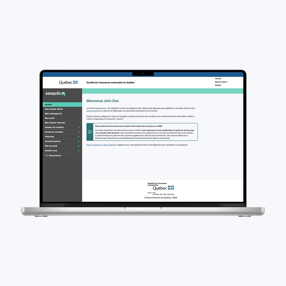
This team project was completed as part of a UX Evaluation course during my Master's, in partnership with a real government client: the Société de l'Assurance Automobile du Québec (SAAQ). The organization wanted a thorough evaluation of the user experience on SAAQclic, their online platform for managing vehicle-related services.
The mandate was clear: identify friction points, validate usage hypotheses, and deliver prioritized UX recommendations backed by both qualitative and quantitative research.
Team and Collaboration
Five-person UX team with direct client access
The project was carried out by a team of five. Within that team, I held two distinct responsibilities that shaped the project's final quality significantly.
First, I was the only team member with Figma and graphic design experience, which made me the natural lead for all visual deliverables. Producing high-fidelity mockups was not part of the original scope. It was something I pushed for because I knew it would make the recommendations land more effectively with the client. It did.
Second, I managed the relationship with the SAAQ directly. That meant being the main point of contact throughout the project, handling communication with their digital and UX team, and representing our work in the final presentation.
Problem
Identifying where SAAQclic had usability issues
SAAQclic is a critical tool for Quebec citizens managing vehicle registration, driver's licenses, and related administrative tasks. The SAAQ wanted an evaluation that was neutral, data-backed, and oriented toward concrete solutions.
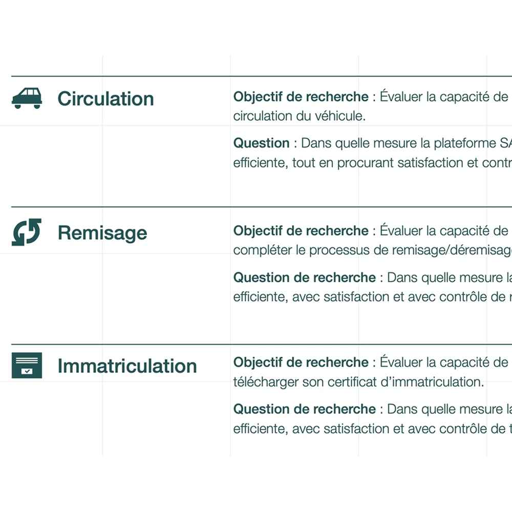
We structured the evaluation around three key areas of the platform: informational tasks, transactional tasks, and status comprehension (vehicle circulation, registration, and storage status).
Process and Methods
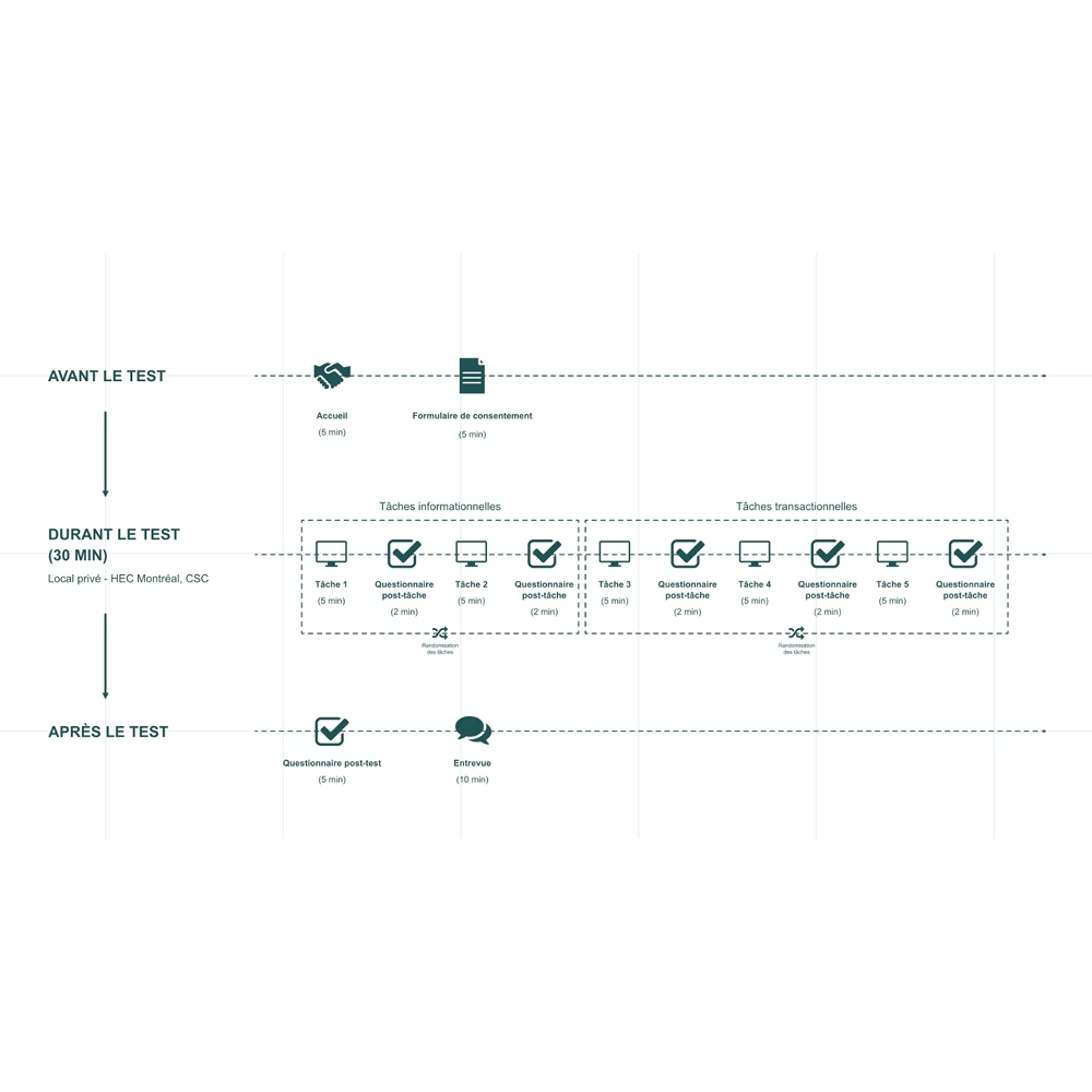
Mixed-method usability testing
We ran a controlled usability study combining direct observation, guided task walkthroughs, and post-test interviews. The sessions were conducted under strict security and data access constraints imposed by the government client. Concretely, this meant working with a specific testing version of the platform, accessible only via a controlled remote connection with an IP allow list and a defined time window. This was a real logistical challenge: the access window was limited, the deadline was fixed, and participant recruitment had to move fast. We used every available channel to reach enough participants in time, including targeted social media posts with incentives and flyers placed strategically across Montreal.
Quantitative measures
- Task success rate
- Completion time
- Perceived effort (CES)
- Satisfaction (CSAT)
- Perceived usability (SUS)
- Sense of control
Qualitative measures
- Observed behaviors during tasks
- Spontaneous verbatim comments on the interface
- Post-test interviews with a standardized guide
- Overall perceptions of trust, flow, and clarity
Key Decisions and Trade-offs
Pushing beyond the original scope with mockups
One deliberate choice I made was to invest time in high-fidelity mockups, even though it was not required by the mandate. The risk was straightforward: more work, same deadline. I made the call because recommendations without visual support often stay on paper. Showing a redesigned interface makes it easier for a client team to understand, discuss, and act on what is being proposed.
The bet paid off. The client specifically highlighted the mockups as one of the strongest aspects of our delivery.
Designing around security and confidentiality constraints
The government context introduced real constraints on how data could be collected and handled. Rather than push back on those restrictions, we designed the study protocol around them from the start. That meant making deliberate choices about what to measure, how to document observations, and what could realistically be included in the final report. It was a good lesson in adapting research rigor to institutional realities without compromising the quality of findings.
Deliverables
A structured UX evaluation report
The final deliverable included a full UX evaluation report covering friction points across all three task categories, a prioritized set of design recommendations, and supporting high-fidelity mockups for the most critical improvements.
The report was structured to be immediately usable by SAAQ's internal team, with findings organized by priority and recommendations tied directly to observed pain points.
Results
Strong reception from the client
The final presentation to SAAQ's digital and UX team was very well received. The client highlighted the clarity of the recommendations, the relevance of the identified friction points, the professional quality of the report, and the visual and strategic quality of the mockups.
The project gave the SAAQ a clear, prioritized view of the improvements needed to optimize the SAAQclic experience.
Conclusion and Learnings
UX consulting in a constrained, real-world context
Running a full UX evaluation for a government client as a grad student is not a typical academic exercise. The stakes were real, the constraints were real, and the client expected professional output.
- Usability testing under strict confidentiality demands careful protocol design upfront
- Owning client communication directly sharpens how findings get framed and presented
- Going beyond scope, when done with clear intent, builds trust fast
- Pairing recommendations with mockups changes the conversation from abstract to actionable
Want to connect?
The door is open
